Tracking sentiment shifts
The Tableau 2021 Student Iron Viz competition challenged participants to tell a story using music data. The entries were evaluated based on creativity, analysis, beauty/design, and adherence to best practices.

MY ROLE
This was a solo project I submitted for Tableau's Student Ironviz Competition 2021. I brainstormed ideas, iterated on prototypes, collected and modified data using Python, and built the dashboard in Tableau. Tableau provided me the opportunity to join its conference in Las Vegas, meet the datafam community, and discuss my experience.
RESULTS
Utilizing Spotify metrics, Billboard songs, lyric keywords, and the NRCLex library, I crafted a dashboard that illustrated the shifting sentiments of people over time through their preferences in music. The visualization was recognized as one of the winning entries to the global Tableau Student Ironviz competition in 2021.
FINDING THE RIGHT DATA
The primary challenge was finding the right datasets to effectively convey a story. I began with Spotify data, which included metrics on the positivity of songs. This inspired me to explore how these attributes could reflect public sentiment over time. Using Spotify, I analyzed the positivity, speechiness, loudness, and energy of popular songs annually. I expanded my research to categorize the emotion of song lyrics each decade with the help of the NRCLex library.
The primary challenge was finding the right datasets to effectively convey a story.
FINDING THE RIGHT STORY
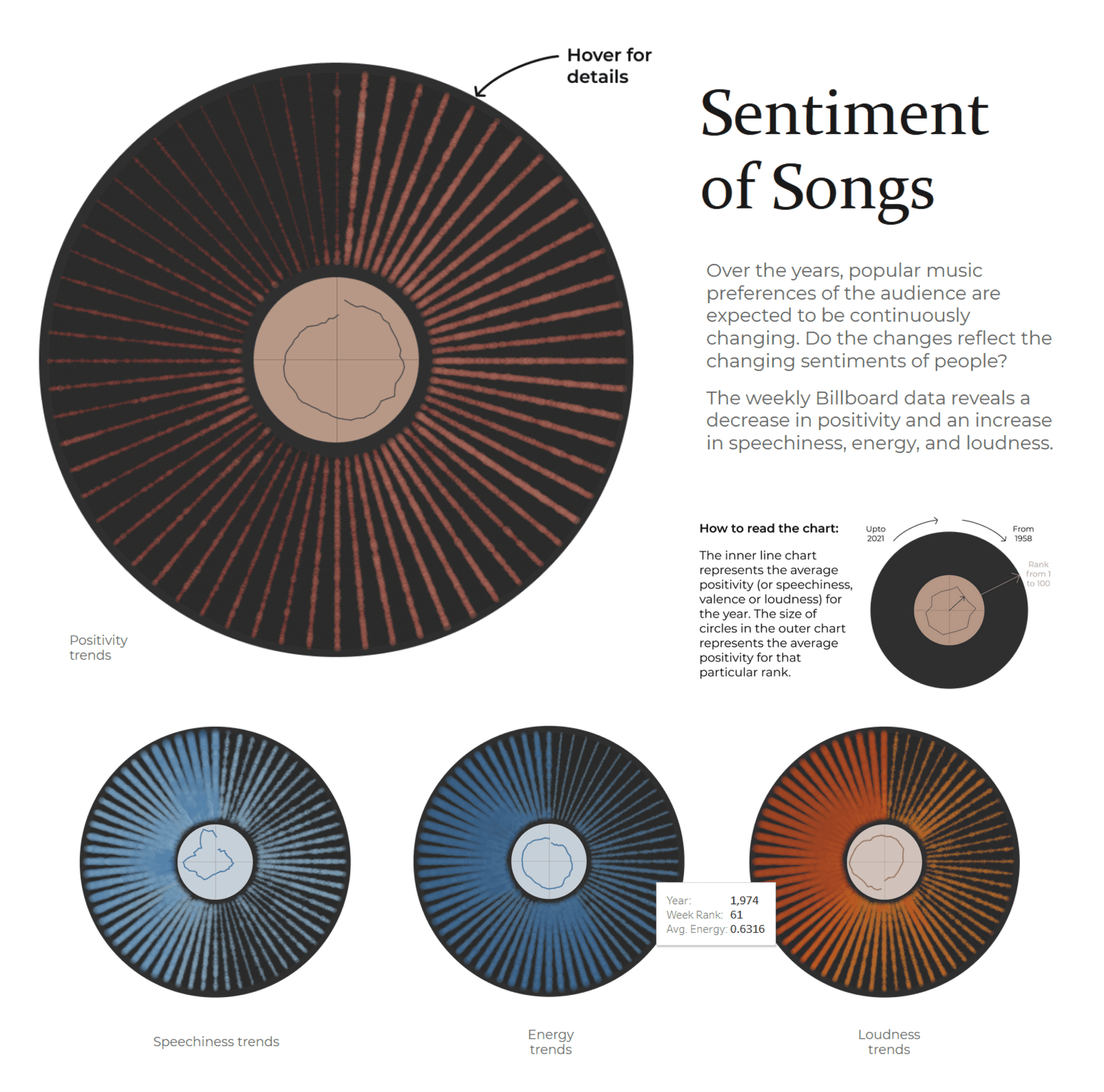
I opted for radial designs that echoed the appearance of vinyl records.
In my visualizations, I opted for radial designs that echoed the appearance of vinyl records. These visuals revealed a trend of decreasing positivity in music, while speechiness, loudness, and energy levels have increased over the years.
Further analysis showed a concurrent decrease in negative keywords and a marked rise in expressions of anger, disgust, fear, and darkness during the 2000s. Lastly, an exploratory feature of the dashboard enabled an in-depth review of the positivity trends in songs over the years, uncovering interesting patterns such as a surge in positive songs around Christmas.
OUTCOME
The feedback from the judges read "Beautiful viz! I'm not usually a fan of radial vizzes, but they were used really effectively here to show how music has changed over time. Interesting analysis of themes in the music over time as well. Good design choices make the viz accessible for most readers".
After the results' announcement, at the Tableau conference in Las Vegas, I shared insights from my project, and engaged with the community to discuss the latest developments in the field. This experience enhanced my interest in and understanding of data and storytelling.
