Scrollytelling with Data
The challenge was to create a scrollytelling website that presented data on police violence in the US for my graduate class, 'Principles of Data Visualization'.

MY ROLE
RESULTS
Utilizing the tools Tableau, AfterEffects, and LottieFiles and HTML/CSS/JS, I developed a website that narrated a story through insights revealed and charts animated upon scrolling. The site also featured an interactive data exploration tool, enabling users to delve into the data and discover their own insights.

PROBLEM IDENTIFICATION
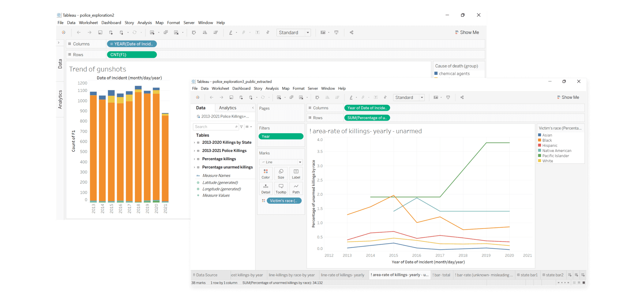
We explored the data using Tableau and conducted literature review before storyboarding various narration approaches.
Our initial major task was to select the most suitable dataset—optimal in size and rich in significant, engaging stories. After cleaning the dataset, we imported it into Tableau for exploratory analysis to pinpoint key insights. Concurrently, a literature review helped clarify these insights and identify narratives that integrated with our story.

STORY DEVELOPMENT
Our exploration of the data and subsequent literature review yielded three key focal points:
Magnitude: We compared the total number of cases in the US to those in other countries, uncovering scholarly articles that speculated on possible reasons for these disparities. We also investigated correlations between the number of incidents, time, geography, and the political climate.
Use of Weapon: Our analysis identified firearms as the predominant weapon used both by police officers and alleged victims. Our visualizations aimed to illustrate the impact of firearm possession on police violence.
Racial Bias: We discovered that victims not carrying weapons were predominantly from specific racial backgrounds. This finding was supported by numerous research studies, and we incorporated additional news articles about individual cases and their broader implications.
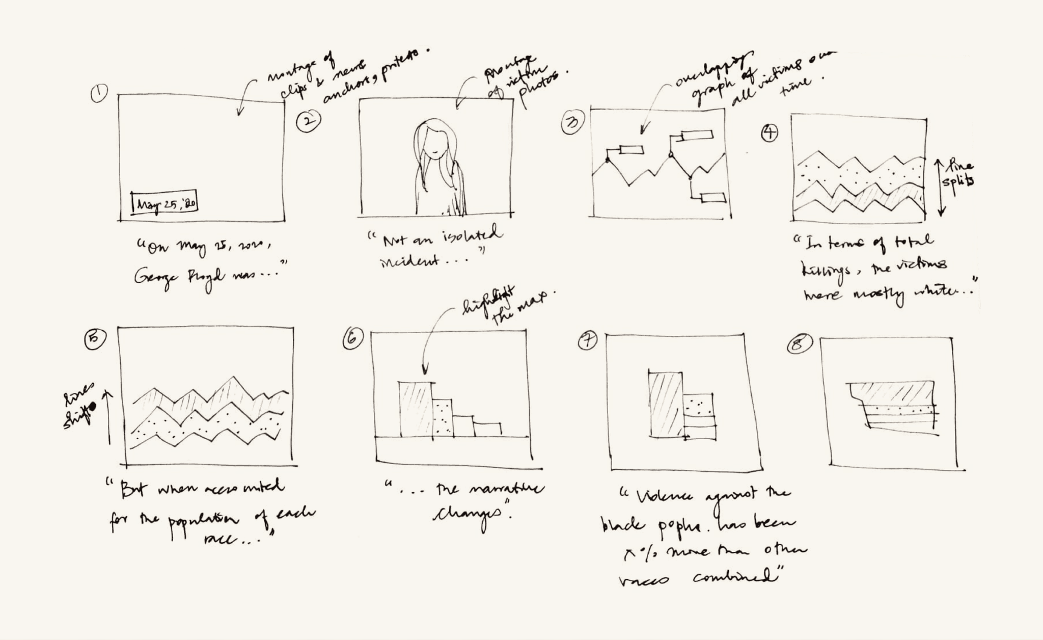
We storyboarded various narration approaches before deciding on a sequence that began with an individual victim's story, expanded to include international comparisons, and concluded with a comprehensive data visualization for user interaction.

OUTCOME & LEARNING
For the final output, I built a website using Tableau dashboards and the supporting research data, with our storyboards serving as the framework. I utilized Illustrator, After Effects, and BodyMovin to convert the charts into Lottie files, enabling scroll-triggered animations. Additionally, I embedded the unit visualization we created for data exploration. Rather than aggregating the data points as we did for the story, we allowed them to be reorganized and visualized, empowering users to discover insights independently.
Through the coursework and project, we learned the impact of visualizations and storytelling. The same few data points can create a different impact or tell a different story depending on the visualization. While expanding the possibilities of what can be created using data, it also increases the responsibility of the designer in telling the right story.